Empowering fundraisers to craft memorable donation experiences
Helping fundraisers create exceptional donation experiences. Processing over $25,000 in donations.
Designer / Product Manager
April 2022 - July 2022
Outcome
We launched the donation form builder with 5 charities across Canada. They would eventually become paying customers and would process over $25,000 in donations.
$25,000
in donations
5
new customers
11
fundraisers
Why donation forms?
Donation forms are key drivers of charity and non-profit revenue - with online giving increasing by 21% over the last year amid the COVID-19 pandemic. The importance of providing a world-class donation experience is becoming ever more important as donor preferences evolve.
The problem
I interviewed 7 staff from our partners and an additional 6 staff from other organizations. I discovered that despite online donations being an essential part of the fundraising process, fundraisers had very little knowledge about how to create a good donation experience.
Form building tools offer limited control over the look and feel. When they do, users feel overwhelmed by the range of customization and use them inadqueately. I eventually arrived at the problem statement below:
“I often don’t know where to start. I’m overwhelmed by all the different options and I’m not given enough guidance.”
— Jillian, Executive Assistant
“The tool we use is so limiting in terms of what kind of customization options I have.”
— Michael, Board Member
Phase
Awareness
Consideration
Research
Intent
First Gift
Engaged
Fatigue
Lapsed
Goals
Find an organization that supports a cause they're interested in.
Narrow down the different options they have.
Understand their impact and how the charities use their donation.
Select a charity to support and find a way to make a donation.
Support an organization that aligns with their values.
Learn more about their programs and their mission.
Reduce support to the organization.
Find another charity to support.
Emotions


Intrigued by how different organizations address a social problem.
Overwhelmed by the amount of different organizations are out there.
Skeptical about the charity and the information available to them.
Annoyed with the donation form experience and lack of personalization.
Enthusiastic about supporting an organization that solves an important social problem.
Delighted with how the charity fulfills their mission.
Frusturated with the organization but still hopeful.
Dissatisfied and disappointed with the charity.
Activities
- Searched for charities that support a particular social problem.
- Checks charity aggregate sites like CanadaHelps.
- Forms initial opinion of the different charities and considers supporting the charity.
- Considers other charities that address similar issues.
- Visits website, donation form, social media.
- Conducts research on the legitimacy of the charity through third party sources.
- Consults reviews on Google and Facebook to understand the organization's impact.
- Connects with people from the organization
- Chooses a charity and decides to make a donation.
- Visits the charity's donation form and goes through the form.
- Makes their first donation to the organization.
- Shares their gift on social media.
- Deepens understanding and affinity for the organization and their impact by consuming content.
- Engages with the charity via social media or directly with a fundraiser.
- Reduces donation frequency.
- Decreases donation amount.
- Cancels their donation.
- Unfollows the organization on social media and other channels
- Stops responding to calls or letters
Pain Points
- Difficult to sift through the thousands of different charities that solve similar social problems.
- Searching for organizations that support specific causes can be difficult
- Finds it difficult to sift through organization's websites to find the necessary information.
- Unable to find information about impact.
- Can’t find connections to the organization to learn more.
- No mechanism to compare organizations outside of a mental list or spreadsheet.
- Finds donation forms difficult to use.
- Often unsure about the impact of their donation.
- Finds forms poorly branded.
- Some organizations don't have donation forms - rely on PayPal or E-Transfers.
- Not properly thanked for their donation.
- Not always followed-up with following their donation.
- They don't always receive donation receipts.
- Has to contact organization to increase their contribution or change frequency of donations.
- Don’t receive personalized content.
- Has to jump through hoops to lower their contribution
- Finds it difficult to talk to someone within the organization since they're not "major donors".
- Don’t receive personalized content.
- Has to jump through hoops to stop contribution.
- Continues to receive marketing and promotional content despite their dissatisfaction with the organization.
Understanding donor pain points
While I had an understanding of the fundraiser problems, I wasn’t considering the donor experience. Without an understanding the donor pain points, I couldn’t address the issue of lost revenue.
I approached this by interviewing 11 donors and put together this journey map to get a better understanding of the donor experience and see how we can them with the form builder.
Mapping donor pain points to features
Form builder should enable fundraisers to build delightful experiences that addresses donor pain points. Our goal was to have the donor experience baked into every feature we build.
We came up with features based on discussions with our partners and a thorough analysis of our competitor’s products.
Pain Point
Opportunity
Feature
Unsure about the
impact of their gift

Communicate the
impact of their gift

Preset amounts with custom descriptions
Forms have poor
branding

Easily include custom branding in the form
Custom messaging
and colours
Donor not thanked
for their donation
Easily include custom thank you messaging
Custom thank you page
Donors forced to contact the org to change their gift
Donor self-service
Donor portal
Build donation forms
Create causes
Manage forms
Manage causes
Setup
form
Customize messaging
Customize theme
Edit donation amounts
Change thank
you page
Learn how to implement
View dashboard
View form overview
Create new cause
Manage causes
View cause overview
Edit existing
cause
Name form
Create URL
View message
in form
Add headline copy
Add body copy
View theme
in form
Add header image
Add logo
Select colours
Check accessibility
View amounts in form
Add preset amounts
Add preset descriptions
Add custom description
View thank you
in form
Add headline copy
Add body copy
Add survey link
Embed iFrame on website
Embed donate button
Contact support
Create new form
View all form metrics
Search all existing forms
View active forms
View drafts
Edit Form
Preview form
Share form link
View form metrics
View gifts and donor from form
Name cause
Add internal description
Save cause
Create new cause
View metrics
View existing causes
View archived causes
View donors
in cause
View gifts
in cause
Edit cause
Archive cause
Edit cause name
Edit cause description
Save changes
Activities
Tasks
Sub-tasks
Mapping out user stories
I created a user story map to capture the different activities and user goals. This would allow me to focus on user problems instead of being bogged down by pages of requirements.
Wireframing the form builder
Since we were launching a brand new product, it was important for us to get an idea of some of the core aspects of the product and how content would be organized on the page. To do this I did a few wireframes to understand the overall structure and how users might interact with it.


Back
Next
Step 1: Set up form
Custom URL (required)
Owner (required)
Configure settings for your donation form.
Give the form a link that clearly identifies it.
Select a team member that will receive notifications regarding your form.
Form name (required)
Used internally and won’t be seen by donors.
Input field
Input field
Input field
Donation form breakdown
I didn’t need to reinvent the wheel with donation forms. I went with many tried and true patterns that were proven to have positive effects on conversion.
This included multi-step forms, progress indicators, and pinned buttons.

Donate today
We’re a global organization working to end the injustice of poverty.
Your donation will help us save lives in disasters and tackle the root causes of poverty.


How would you like to
make your donation?
Monthly
One-time
Next


Multi-step form
Reduces cognitive load and helps donors focus on a single task.
Custom messaging
Organizations can effectively communicate their mission to prospective donors.
Organizations can also replace the background with an image.

Pinned button
Optimized for seamless
forward navigation.


Usability testing - Donation Forms
11 donors
It was important that the we recruited a diverse group of individuals to get an understanding of the types of donors.
7 staff from partner organizations
We conducted tests with the staff from our 4 partner organizations since they would have a unique perspective on the donation forms.
Outcome
After synthesizing all the feedback, I revised the designs to address the pain points that participants were experiencing. I also made UI improvements to improve the visual design.
You can view a breakdown of the decisions or view the final prototypes.


Usability testing - Form builder
Improving the UI to match a user’s mental model
It was clear that participants were getting confused about certain aspects of the form builder so, I had to revisit the patterns and validate their effectiveness.
Meeting user needs
During testing, I quickly realized that some important features were missing and that it didn’t accurately capture a user’s workflow. More specifically, controlling how donors cover fees and customizing the follow-up email.
Writing requirements
After a final design review with the rest of the team, I create a list of product requirements that I would use to hand off to my team’s developer. It provided us with a better idea of the effort required and how we should prioritize the work.
Once I wrote the requirements and reviewed them with the team, I created tickets in Notion, segmented them into a couple of releases, and created a backlog of follow-up work.
Final product
Participants found the form builder easier to use, with some citing that it was an improvement over their previous experiences. Usability testing also showed that fundraisers were able to easily build a donation form.
You can view the final prototype which includes the onboarding, form builder, causes, and relevant dashboards.
Reflections
The difficulties of designing for multiple user groups
When I first started thinking through the form builder, I thought my main goal was to only solve problems for fundraisers. However, as I continued to learn about the project, I quickly realized that form builder should not only be a tool that makes a fundraiser’s job easier but one that enables exceptional donor experiences.
Ultimately this project reminded me take a first-principles approach to building a product and think more deeply about the different user groups that would be affected by this product.
Creating a product using limited data
Due to the nature of the non-profit industry, finding data and understanding the current state was quite difficult. Based on primary and secondary research, we knew there was a conversion problem and as a result organizations were missing out on potential revenue.
I had to rely on qualitative data via surveys, user research, and usability testing to understand the pain points and arrive at a solution. We had to take a research > build > launch > monitor approach which challenged me to think about the gaps we needed to fill and what data we needed to collect once we launch the feature.
© Chris Tran 2025 All Rights Reserved
Empowering fundraisers to craft memorable donation experiences
Helping fundraisers create exceptional donation experiences. Processing over $25,000 in donations.
Designer
Product Manager
April 2022 - July 2022
Outcome
We launched the donation form builder with 5 charities across Canada. They would eventually become paying customers and would process over $25,000 in donations.
$25,000
in donations
5
new customers
11
fundraisers
Why donation forms?
Donation forms are key drivers of charity and non-profit revenue - with online giving increasing by 21% over the last year amid the COVID-19 pandemic. The importance of providing a world-class donation experience is becoming ever more important as donor preferences evolve.
The problem
I interviewed 7 staff from our partners and an additional 6 staff from other organizations. I discovered that despite online donations being an essential part of the fundraising process, fundraisers had very little knowledge about how to create a good donation experience.
Form building tools offer limited control over the look and feel. When they do, users feel overwhelmed by the range of customization and use them inadequately.
“I often don’t know where to start. I’m overwhelmed by all the different options and I’m not given enough guidance.”
— Jillian, Executive Assistant
“The tool we use is so limiting in terms of what kind of customization options I have.”
— Michael, Board Member
Understanding donor pain points
While I had an understanding of the fundraiser problems, I wasn’t considering the donor experience. Without an understanding the donor pain points, I couldn’t address the issue of lost revenue.
I approached this by interviewing 11 donors and put together this journey map to get a better understanding of the donor experience and see how we can them with the form builder.
Phase
Awareness
Consideration
Research
Intent
First Gift
Engaged
Fatigue
Lapsed
Goals
Find an organization that supports a cause they're interested in.
Narrow down the different options they have.
Understand their impact and how the charities use their donation.
Select a charity to support and find a way to make a donation.
Support an organization that aligns with their values.
Learn more about their programs and their mission.
Reduce support to the organization.
Find another charity to support.
Emotions

Intrigued by how different organizations address a social problem.
Overwhelmed by the amount of different organizations are out there.
Skeptical about the charity and the information available to them.
Annoyed with the donation form experience and lack of personalization.
Enthusiastic about supporting an organization that solves an important social problem.
Delighted with how the charity fulfills their mission.
Frusturated with the organization but still hopeful.
Dissatisfied and disappointed with the charity.
Activities
- Searched for charities that support a particular social problem.
- Checks charity aggregate sites like CanadaHelps.
- Forms initial opinion of the different charities and considers supporting the charity.
- Considers other charities that address similar issues.
- Visits website, donation form, social media.
- Conducts research on the legitimacy of the charity through third party sources.
- Consults reviews on Google and Facebook to understand the organization's impact.
- Connects with people from the organization
- Chooses a charity and decides to make a donation.
- Visits the charity's donation form and goes through the form.
- Makes their first donation to the organization.
- Shares their gift on social media.
- Deepens understanding and affinity for the organization and their impact by consuming content.
- Engages with the charity via social media or directly with a fundraiser.
- Reduces donation frequency.
- Decreases donation amount.
- Cancels their donation.
- Unfollows the organization on social media and other channels
- Stops responding to calls or letters
Pain Points
- Difficult to sift through the thousands of different charities that solve similar social problems.
- Searching for organizations that support specific causes can be difficult
- Finds it difficult to sift through organization's websites to find the necessary information.
- Unable to find information about impact.
- Can’t find connections to the organization to learn more.
- No mechanism to compare organizations outside of a mental list or spreadsheet.
- Finds donation forms difficult to use.
- Often unsure about the impact of their donation.
- Finds forms poorly branded.
- Some organizations don't have donation forms - rely on PayPal or E-Transfers.
- Not properly thanked for their donation.
- Not always followed-up with following their donation.
- They don't always receive donation receipts.
- Has to contact organization to increase their contribution or change frequency of donations.
- Don’t receive personalized content.
- Has to jump through hoops to lower their contribution
- Finds it difficult to talk to someone within the organization since they're not "major donors".
- Don’t receive personalized content.
- Has to jump through hoops to stop contribution.
- Continues to receive marketing and promotional content despite their dissatisfaction with the organization.
Mapping donor pain points to features
Form builder should enable fundraisers to build delightful experiences that addresses donor pain points. Our goal was to have the donor experience baked into every feature we build.
We came up with features based on discussions with our partners and a thorough analysis of our competitor’s products.
Pain Point
Opportunity
Feature
Unsure about the
impact of their gift

Communicate the
impact of their gift

Preset amounts with custom descriptions
Forms have poor
branding

Easily include custom branding in the form
Custom messaging
and colours
Donor not thanked
for their donation
Easily include custom thank you messaging
Custom thank you page
Donors forced to contact the org to change their gift
Donor self-service
Donor portal
Mapping out user stories
I created a user story map to capture the different activities and user goals. This would allow me to focus on user problems instead of being bogged down by pages of requirements.
Build donation forms
Create causes
Manage forms
Manage causes
Setup
form
Customize messaging
Customize theme
Edit donation amounts
Change thank
you page
Learn how to implement
View dashboard
View form overview
Create new cause
Manage causes
View cause overview
Edit existing
cause
Name form
Create URL
View message
in form
Add headline copy
Add body copy
View theme
in form
Add header image
Add logo
Select colours
Check accessibility
View amounts in form
Add preset amounts
Add preset descriptions
Add custom description
View thank you
in form
Add headline copy
Add body copy
Add survey link
Embed iFrame on website
Embed donate button
Contact support
Create new form
View all form metrics
Search all existing forms
View active forms
View drafts
Edit Form
Preview form
Share form link
View form metrics
View gifts and donor from form
Name cause
Add internal description
Save cause
Create new cause
View metrics
View existing causes
View archived causes
View donors
in cause
View gifts
in cause
Edit cause
Archive cause
Edit cause name
Edit cause description
Save changes
Activities
Tasks
Sub-tasks
Wireframing the form builder
Since we were launching a brand new product, it was important for us to get an idea of some of the core aspects of the product and how content would be organized on the page. To do this I did a few wireframes to understand the overall structure and how users might interact with it.


Back
Next
Step 1: Set up form
Custom URL (required)
Owner (required)
Configure settings for your donation form.
Give the form a link that clearly identifies it.
Select a team member that will receive notifications regarding your form.
Form name (required)
Used internally and won’t be seen by donors.
Input field
Input field
Input field
Donation form breakdown
I didn’t need to reinvent the wheel with donation forms. I went with many tried and true patterns that were proven to have positive effects on conversion.
This included multi-step forms, progress indicators, and pinned buttons.

Donate today
We’re a global organization working to end the injustice of poverty.
Your donation will help us save lives in disasters and tackle the root causes of poverty.


How would you like to
make your donation?
Monthly
One-time
Next


Multi-step form
Reduces cognitive load and helps donors focus on a single task.
Custom messaging
Organizations can effectively communicate their mission to prospective donors.
Organizations can also replace the background with an image.

Pinned button
Optimized for seamless
forward navigation.

Usability testing - Donation Forms
11 donors
It was important that the we recruited a diverse group of individuals to get an understanding of the types of donors.
7 staff from partner organizations
We conducted tests with the staff from our 4 partner organizations since they would have a unique perspective on the donation forms.
Outcome
After synthesizing all the feedback, I revised the designs to address the pain points that participants were experiencing. I also made UI improvements to improve the visual design.
You can view a breakdown of the decisions or view the final prototypes.
Usability testing - Form builder
Improving the UI to match a user’s mental model
It was clear that participants were getting confused about certain aspects of the form builder so, I had to revisit the patterns and validate their effectiveness.
Meeting user needs
During testing, I quickly realized that some important features were missing and that it didn’t accurately capture a user’s workflow. More specifically, controlling how donors cover fees and customizing the follow-up email.
Writing requirements
After a final design review with the rest of the team, I create a list of product requirements that I would use to hand off to my team’s developer. It provided us with a better idea of the effort required and how we should prioritize the work.
Once I wrote the requirements and reviewed them with the team, I created tickets in Notion, segmented them into a couple of releases, and created a backlog of follow-up work.
Number
Epic
Feature
User Story
Acceptance Criteria
OB001
Required Steps
Organization Information
As a first-time form builder user, I would like to add important organization information.
- If user clicks CTA, take them to a page that asks them to fill out their organization information.
- User should be able to upload their logo.
- User should be able to add their organization's name and charity registration number.
- User should be able to add their organization's address.
- User should be able to upload a picture of their authorized individual.
- User should be able to add the name of their authorized individual and their title/role.
- Clicking cancel should take them back to the checklist and the step should be in the incomplete state.
- Completing cause should change progress bar to 25%.
OB002
Required Steps
Connect Stripe
As a first-time form builder user, I would like to connect my Stripe account with Prospr.
- If user clicks CTA, take them to Stripe connection page.
- Completing step should change progress bar to 50%.
OB003
Required Steps
Add causes
As a first-time form builder user that hasn't created any causes, I would like to create a new cause.
- If user has already created a cause before, checklist should already show completed.
- If user hasn't already created a cause, navigate them to new page that asks them to create a default cause.
- If creating default cause, cause name should be in the disabled state.
- If user clicks create cause, take them back to checklist.
- If user clicks create and add another, present them. empty cause creation screen. Clicking creating cause should take them back to the checklist.
- Clicking cancel should take them back to the checklist and the step should be in the incomplete state.
- Completing step should change progress bar to 75%.
FB001
Form Builder
Preview
As a user, I would like to be able to preview my form and the changed I'm making in the form builder.
- User can select mobile, tablet, or desktop.
- Preview screen will depend on the step being edited.
FB002
Form Builder
Progress indicator
As a user, I would like to be shown which step I'm on and how which steps are remaining.
- For a completed step, show blue checkmark.
- For current step, show step with number highlighted in blue.
- For incomplete step, show step with number highlighted grey.
- If user navigates back from a completed step, show outline circle with blue checkmark.
FB003
Form Builder
Form Setup
As a user, I would like to enter administrative information that would help manage the donation form.
- User should be able to enter the internal name of their form.
- User should be able to add an optional description to the form.
- User should be able to enter a custom URL that uses the domain Prospr.cc/.
- User should be able to add an owner of the donation .form. The owner can only be someone that is currently within the organization's team.
FB004
Form Builder
Message
As a user, I would like to customize the message on my donation form.
- User should be able to customize the headline of the form up to 50 characters.
- There should be option to customize the subtitle of the message up to 250 characters.
- Preview screen should be screen with the right side greyed out as to not distract users from the message.
- On mobile, the banner should increase in size as more text is added.
FB005
Form Builder
Theme
As a user, I would like to customize the theme of my donation form.
- Preview screen show Step 1: Frequency with an already selected option.
- User should be able to add an optional background image.
- If a background image is added, a modal to crop the background image should pop up. Crop area should be 640x360 px.
- If a background image is added, an overlay (#1A1A1A, 50%) should be added and text should be white. Text should have a dropshadow (see designs for speicifications).
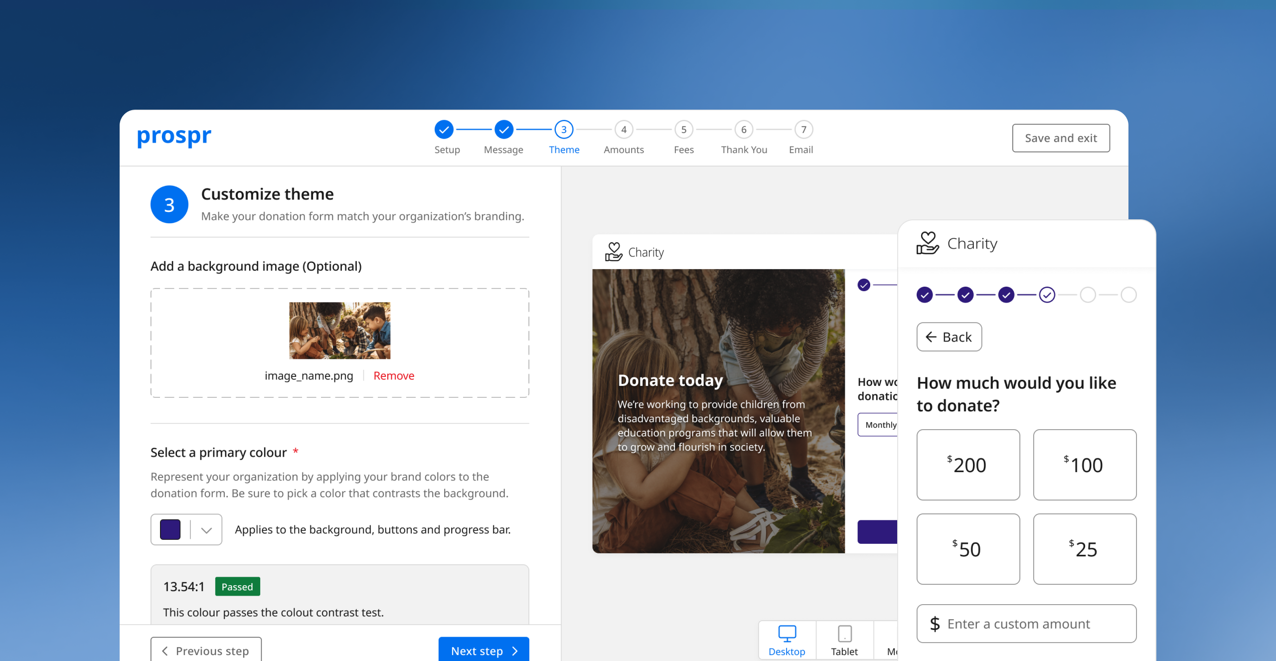
- User should be be able to select a primary colour. The colour should be applied to: primary buttons, progress bar, and the selected state of selection buttons.
- Opening the dropdown should provide a list of preset colours with an input field to enter a hexcode.
- Selecting a preset colour should populate the input field with the colour's hexcode.
- If the selected colour passes, show the "Passed" tag. If the selected colour fails, show the "Failed" tag.
FB006
Form Builder
Donation Amounts
As a user, I would like to customize the donation amounts that a donor can choose from.
- Preview screen show Step 3: Donation Amounts with unfilled preset amounts.
- When not filled, buttons should say add. When filled, buttons should say edit.
- Clicking add should open up a modal that prompts the user to enter an amount and a description up to 120 characters.
- The information in the box should reflect the information that the donor entered.
- By default, the amounts should be ordered by highest to lowest donation amount.
- Users should have a checkbox option to order the donation amounts from lowest to highest.
- Users should be able to enter a description for the custom amount up to 120 characters.
FB007
Form Builder
Processing Fees
As a user, I would like to be able to setup how donors cover processing fees for their donation.
- Preview screen show Step 6: Payment Information.
- Users should be given the option to choose whether the fees should be covered by default.
- Selecting yes should bring up the thank you message. Selecting no should hide it.
- Users should be required to provide a custom thank you message up to 120 characters.
FB008
Form Builder
Thank You Page
As a user, I would like to customize the thank you message a donor sees once they donate.
- Preview screen show Step 7: Thank You Page.
- User should be able to add an optional header image.
- User should be able to customize the headline up to 50 characters.
- User should be able to customize the thank you message up to 500 characters.
- User should be able to customize the text and URL of the button.
FB009
Form Builder
As a user, I would like to customize the email that a donor receives after their donation.
- Preview screen show the email template.
- User should be able to customize the subject line up to 50 characters.
- User should be able to add an optional header image.
- User should be able to customize the body of the email.
- There should be a preset "Dear {Donor First Name}" that appears but donors cannot change.
DB001
Dashboard
All Forms
As a user, I would like to see all the donation forms I've created in one table.
- Button to create a new form that takes them to the first step of form builder.
- User should see metrics for all donation forms: Active forms, total amount raised, average donation, total transactions.
- User should be able to navigate a table showing donation forms - tabs: all, active, drafts, and archived forms.
- User should be able to search table and use filters: date created, saved forms.
DB002
Dashboard
Individual Form Summary
As a user, I would like the view a summary of an individual donation form on a single page.
- User should be able to edit the form which takes them to an already completed donation form. Users can navigate between steps by clicking the progress bar.
- If a user clicks preview, they should be taken to the live donation form.
- If a user clicks share link, the custom url should be saved to their clipboard.
- Users should see metrics: gross donations, fees, net donations, total gifts.
- Users should be able to navigate between gifts and donors tabs on the table.
- Gifts filters: cause, frequency, date
- Donors filters: type, date.
- Users should be able to navigate to an implementation tab which shows them instructions on how to implement the form on their website.
C001
Causes
Empty State
As a first time form builder user, I would like to see a page that prompts me to create my first cause.
- If no caues are created, users should see an empty state w/ CTA to prompt them to create their first cause.
- Clicking CTA takes them to create a new cause.
- If user creates their first cause, user should be prompted to create the default cause "area of greatest need".
C002
Causes
Create New Cause
As a user, I would like to have the ability to create a new cause.
- User should be able to name their cause.
- User should be able to add an optional internal description.
C003
Causes
Edit Cause
As a user, I would like the ability to edit a cause I created.
- User should be able to edit the name of their cause.
- User should be able to edit the description of their cause.
C004
Causes
All Causes Dashboard
As a user, I would like to see all the causes I've created.
- User should be able to see a table with active and archived causes.
- Users should be able to search causes or filter them by saved causes.
C005
Causes
Cause Overview Page
As a user, I would like to view an overview of a cause I created.
- User should be able to archive an active cause
- If a user tries to archive a cause, a modal should pop up that asks to confirm that they want to archive the cause.
- User should be able to edit the cause which takes them to the edit cause flow.
- User should be able to see cause metrics: total donations, average donation, total gifts, total donors.
- User should be able to see a table and navigate between a gifts and donors tab.
- Gift filters: frequency, date.
- Donor filters: donor type, date.
OB004
Required Steps
Launch Form
As a first-time form builder user, I would like to create my first form after completing the necessary steps.
- Clicking CTA should take them to Step 1 of the form builder.
Final product
Participants found the form builder easier to use, with some citing that it was an improvement over their previous experiences. Usability testing also showed that fundraisers were able to easily build a donation form.
You can view the final prototype which includes the onboarding, form builder, causes, and relevant dashboards.
Reflections
The difficulties of designing for multiple user groups
When I first started thinking through the form builder, I thought my main goal was to only solve problems for fundraisers. However, as I continued to learn about the project, I quickly realized that form builder should not only be a tool that makes a fundraiser’s job easier but one that enables exceptional donor experiences.
Ultimately this project reminded me take a first-principles approach to building a product and think more deeply about the different user groups that would be affected by this product.
Creating a product using limited data
Due to the nature of the non-profit industry, finding data and understanding the current state was quite difficult. Based on primary and secondary research, we knew there was a conversion problem and as a result organizations were missing out on potential revenue.
I had to rely on qualitative data via surveys, user research, and usability testing to understand the pain points and arrive at a solution. We had to take a research > build > launch > monitor approach which challenged me to think about the gaps we needed to fill and what data we needed to collect once we launch the feature.
© Chris Tran 2026 All Rights Reserved