Crafting a trading experience that drove $19.5 billion in transaction volume
Product Designer
Product Manager
Feb → Apr (3 months)
Final outcome
Perps is a core driver of revenue and user engagement for Defi App. It marked an important strategic milestone on our journey to becoming ‘Crypto’s Everything App’.
$19.5B
of volume
$6M
in revenue
100K+
traders
Why perpetuals?
From the moment we launched our beta in 2024, our community consistently asked when we’d introduce a perps product. With over $500 billion in volume flowing through perps DEXs in 2024, this presented a clear opportunity to capture a share of the market.
Who are we building for?
We wanted to understand who we were actually building for and what we were going to build so we conducted research to understand the following:
1
Trading behaviours and mental models.
2
Volume and trading frequency.
3
The Hyperliquid experience.
4
Perps products and features.
Speaking to traders
We spoke to 14 traders with different habits, behaviours, and uncover core problems with the current experiences.
The problem
Traders want access to high-leverage and efficient trading tools but existing experiences are complex and make it difficult for users to understand risk, manage positions, and trade confidently. This leads to user errors, liquidations, and low retention.
Determining our target market
Pros
$10M+
Trades only on CEXs, needs deep liquidity, the fastest trade execution, and robust functionality.
Seasoned
$100K - $1M
We spoke to 14 traders who had vastly different habits and behaviours.
Newbies
<
$10K
Minimal trading experience, wants a good mobile experience, and is interested in perps, but low appetite for risk.
We ultimately focused on building for ‘seasoned traders’ because they traded a significant amount of volume which provided a greater opportunity to generate revenue.
The perps landscape
We conducted a deep dive across 15+ perps products, uncovering several common patterns, alongside differences in product philosophy and the order interface.

Usability testing on Hyperliquid
As we were building on top of Hyperliquid’s API, we conducted usability testing with seven traders using Hyperliquid’s interface to identify UX gaps, opportunities for improvement, and potential new functionality.
1
More order types outside of market/limits.
2
More trade configuration
3
A more efficient trading interface.
4
A better mobile experience so they can manage their trades on the go.
5
More transparency on how settings impact their trades and positions.
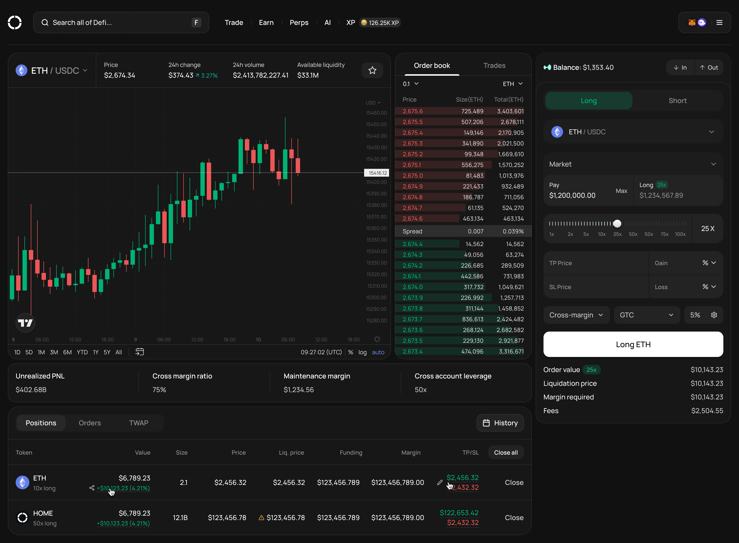
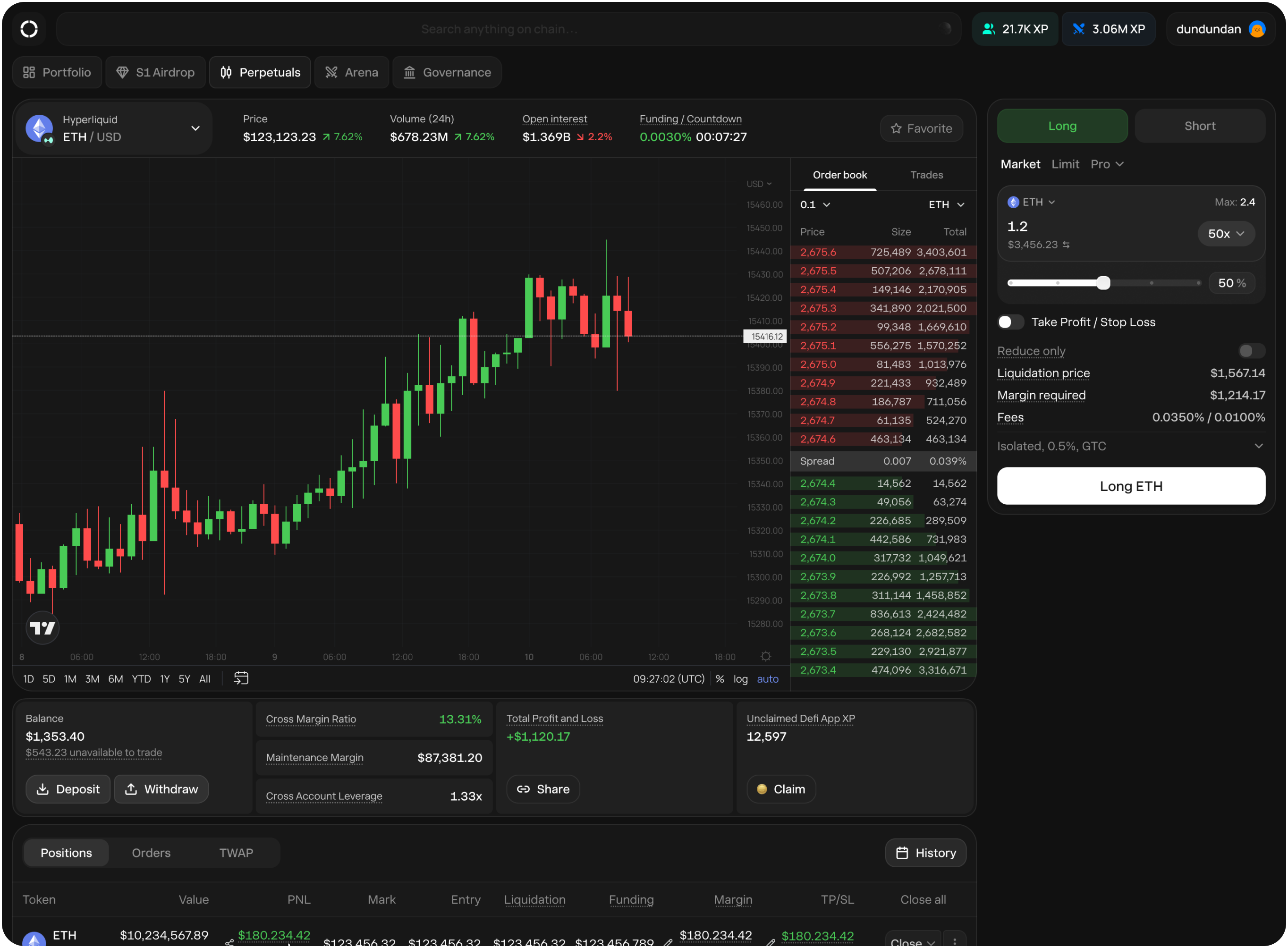
Building the beta
We ran a six-week beta that allowed us to test the UX under real conditions, uncover edge cases, and validate core workflows. Following internal usability testing, we built perps and released it to our beta group.
Initial feedback
Our beta group consisted of 20 seasoned traders who provided us with great feedback.
1
Too many options on the order form causing users to feel overwhelmed.
2
TP/SL didn’t need to be enabled all the time.
3
Traders think in token size, not dollar value.
4
Trade history lacked clarity and scanning was difficult.
5
Mobile dashboard made trading slower. Users wanted everything to be one click away.
6
The positions table on mobile had too many buttons and options.
7
More transparency around their balance, PNL etc.
Tradeoffs
Some stakeholders were adamant that we needed more features, while I was advocating for spending time on developing a solid core experience. We were a small team so we couldn’t do both.
When I think about what makes a great trading experience, it comes down to following things: safety, trust, and reliability. When we’re dealing with real money and high leverage, it’s important to ship an experience that users can trust because it’s “one-strike and you’re out”.
While we lacked functionality - the decision to focus on the order form UX and execution speed and reliability proved to be the right call.
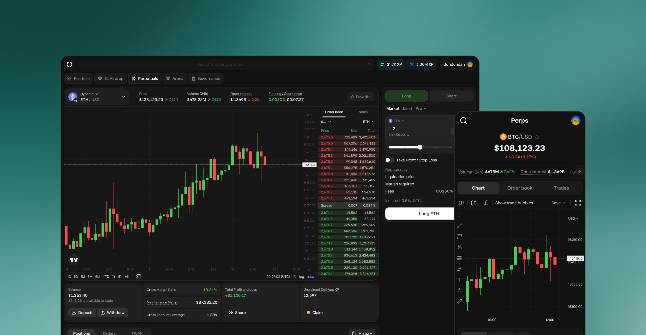
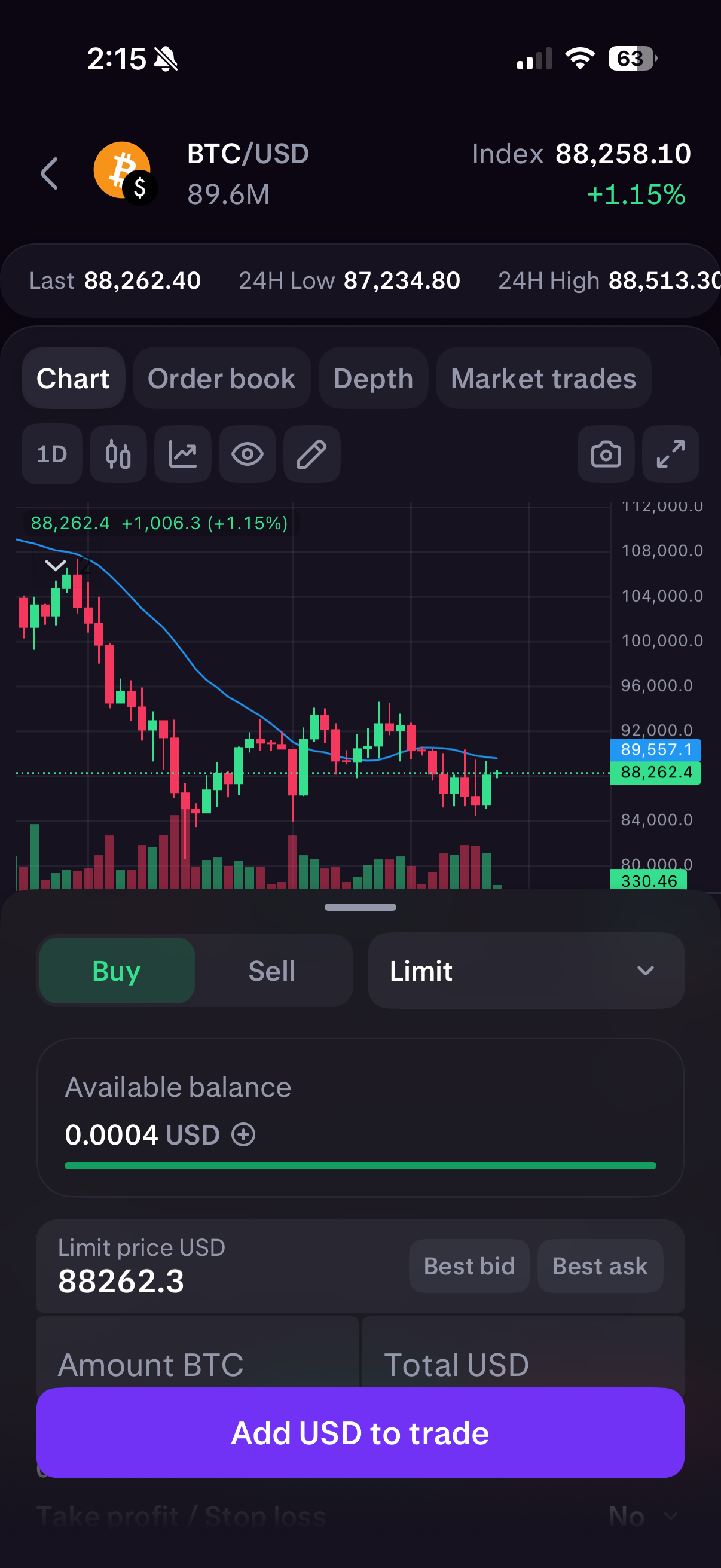
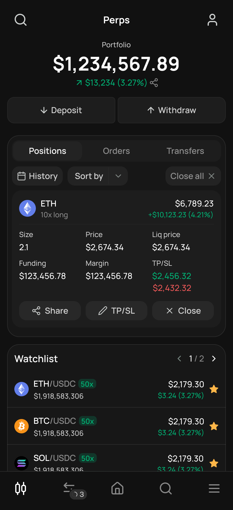
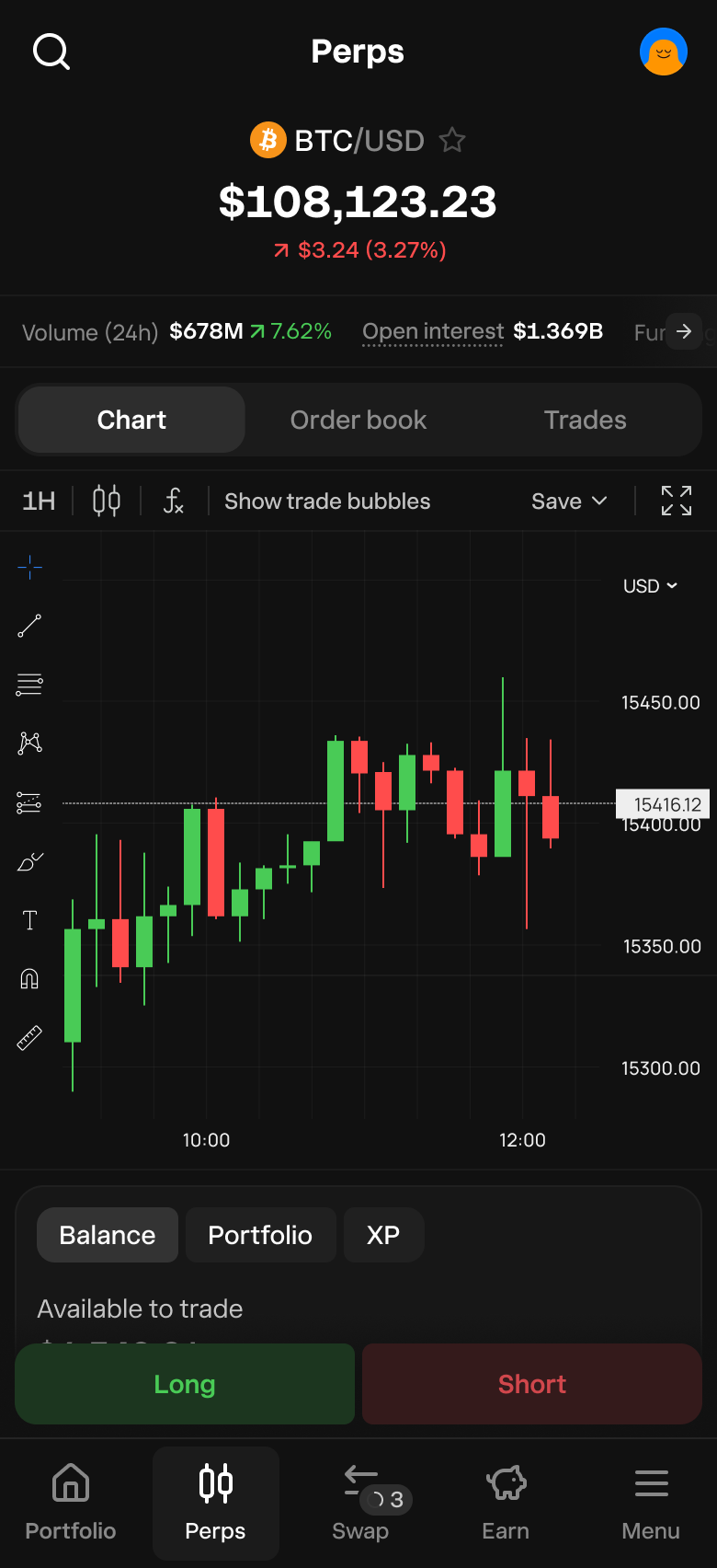
Iteration and release
Throughout the beta and the following months, the product evolved through multiple iterations. We introduced several improvements that enhanced the trading experience and delivered meaningful utility to traders.
Reflections
We often assume that minimal equates to simple. This project challenged that assumption and reinforced the importance of understanding a users’ jobs to be done, mental models, and actual behaviours.
This was also my first time launching a product into beta, which turned out to be the ultimate form of usability testing. Watching real users use the product with real money surfaced insights we never would’ve caught in designs or prototypes. It made reflect on the gaps between designs and real-world usage, and pushed me to reflect on how I can evaluate real world behaviours during the testing phase.
© Chris Tran 2025 All Rights Reserved
Crafting a trading experience that drove $19.5 billion in transaction volume
Product Designer
Product Manager
Feb → Apr (3 months)
Outcome
Perps is a core driver of revenue and user engagement for Defi App, marking an important strategic milestone in our journey towards becoming Crypto’s Everything App.
$19.5 billion
of volume
$6 million
in revenue
100,000+
traders
Why perpetuals?
From the moment we launched our beta in 2024, our community consistently asked when we’d introduce a perps product. With over $500 billion in volume flowing through perps DEXs in 2024, this presented a clear opportunity to capture a share of the market.
Who are we building for?
We wanted to understand who we were actually building for and what we were going to build so we conducted research to understand the following:
1
Trading behaviours and mental models.
2
Volume and trading frequency.
3
The current Hyperliquid experience.
4
The perps landscape and feature expectations
Speaking to traders
We spoke to 14 traders with different habits, behaviours, and uncover core problems with the current experiences.
The problem
Traders want access to high-leverage and efficient trading tools but existing experiences are complex and make it difficult for users to understand risk, manage positions, and trade confidently. This leads to user errors, liquidations, and low retention.
Determining our target market
$10M+
Pros
Trades only on CEXs, needs deep liquidity, the fastest trade execution, and robust functionality.
$100K - $1M
Seasoned
Mostly trades on DEXs, wants an efficient trading experience with trade configurability, and values the transparency of the blockchain.
<
$10K
Newbies
Minimal trading experience, wants a good mobile experience, and is interested in perps, but low appetite for risk.
We ultimately focused on building for ‘seasoned traders’ because they traded a significant amount of volume which provided a greater opportunity to generate revenue.
The perps landscape
We conducted a deep dive across 15+ perps products, uncovering several common patterns, alongside differences in product philosophy and the order interface.


Usability testing on Hyperliquid
As we were building on top of Hyperliquid’s API, we conducted usability testing with seven traders using Hyperliquid’s interface to identify UX gaps, opportunities for improvement, and potential new functionality.
1
More order types outside of market/limits.
2
More trade configuration
3
A more efficient trading interface.
4
A better mobile experience so they can manage their trades on the go.
5
More transparency on how settings impact their trades and positions.
Building the beta
We ran a six-week beta that allowed us to test the UX under real conditions, uncover edge cases, and validate core workflows. Following internal usability testing, we built perps and released it to our beta group.
Initial feedback
Our beta group consisted of 20 seasoned traders who provided us with great feedback.
1
Too many options on the order form causing users to feel overwhelmed.
2
TP/SL didn’t need to be enabled all the time.
3
Traders think in token size, not dollar value.
4
Trade history lacked clarity and scanning was difficult.
5
Mobile dashboard made trading slower. Users wanted everything to be one click away.
6
The positions table on mobile had too many buttons and options.
7
More transparency around their balance, PNL etc.
Tradeoffs
Some stakeholders were adamant that we needed more features, while I was advocating for spending time on developing a solid core experience. We were a small team so we couldn’t do both.
When I think about what makes a great trading experience, it comes down to following things: safety, trust, and reliability. When we’re dealing with real money and high leverage, it’s important to ship an experience that users can trust because it’s “one-strike and you’re out”.
While we lacked functionality - the decision to focus on the order form UX and execution speed and reliability proved to be the right call.
Iteration and release
Throughout the beta and the following months, the product evolved through multiple iterations. We introduced several improvements that enhanced the trading experience and delivered meaningful utility to traders.
Reflections
We often assume that minimal equates to simple. This project challenged that assumption and reinforced the importance of understanding a users’ jobs to be done, mental models, and actual behaviours.
This was also my first time launching a product into beta, which turned out to be the ultimate form of usability testing. Watching real users use the product with real money surfaced insights we never would’ve caught in designs or prototypes. It made reflect on the gaps between designs and real-world usage, and pushed me to reflect on how I can evaluate real world behaviours during the testing phase.
© Chris Tran 2026 All Rights Reserved